


Description
02
The Core Challenge
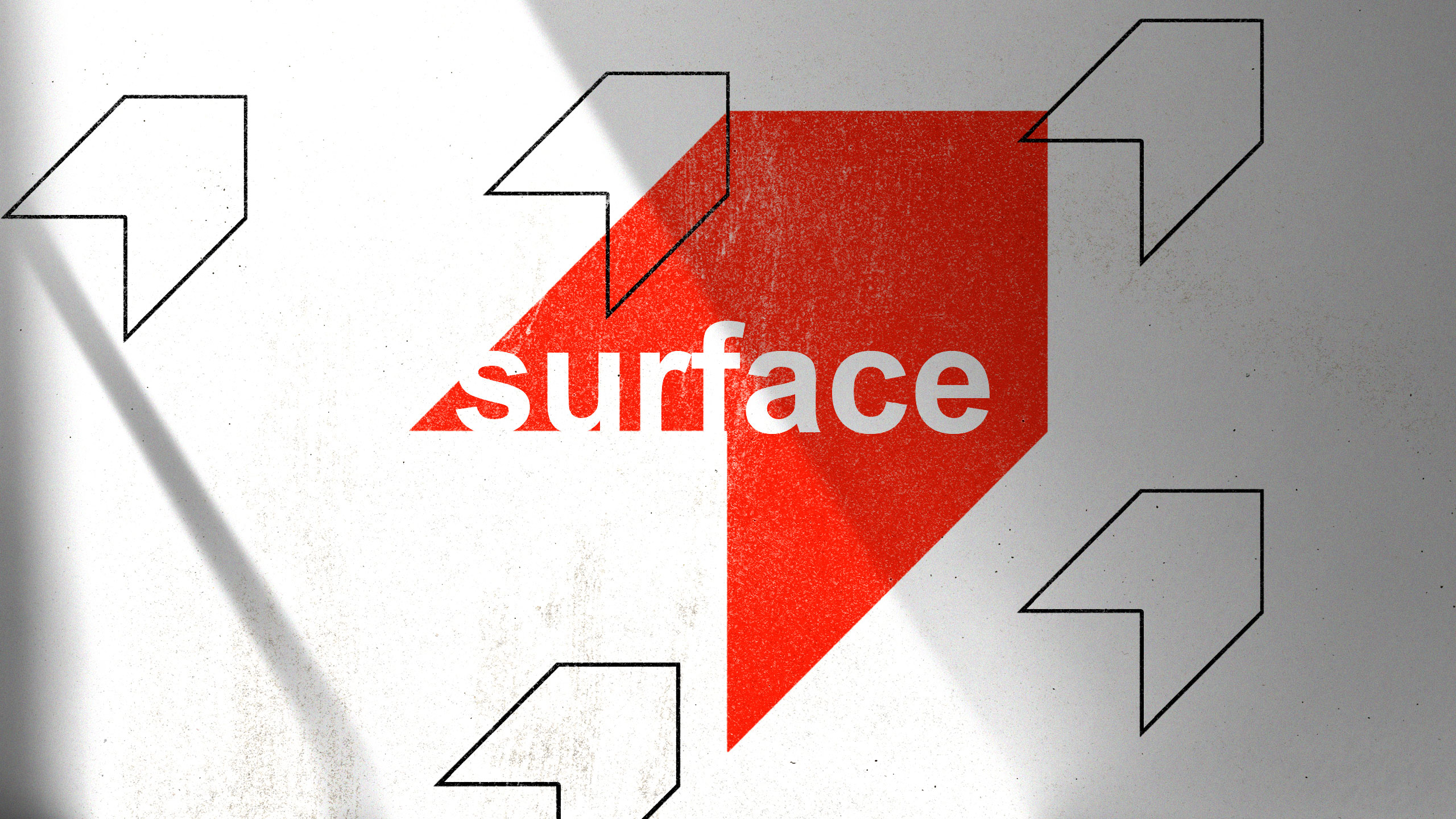
How to convey architectural duality? Surface uses red and white with a minimalist, 3D-illusion logo that balances flatness and volume, creating a refined, modern identity for the exhibition's visual universe.
Visual Language and Logo
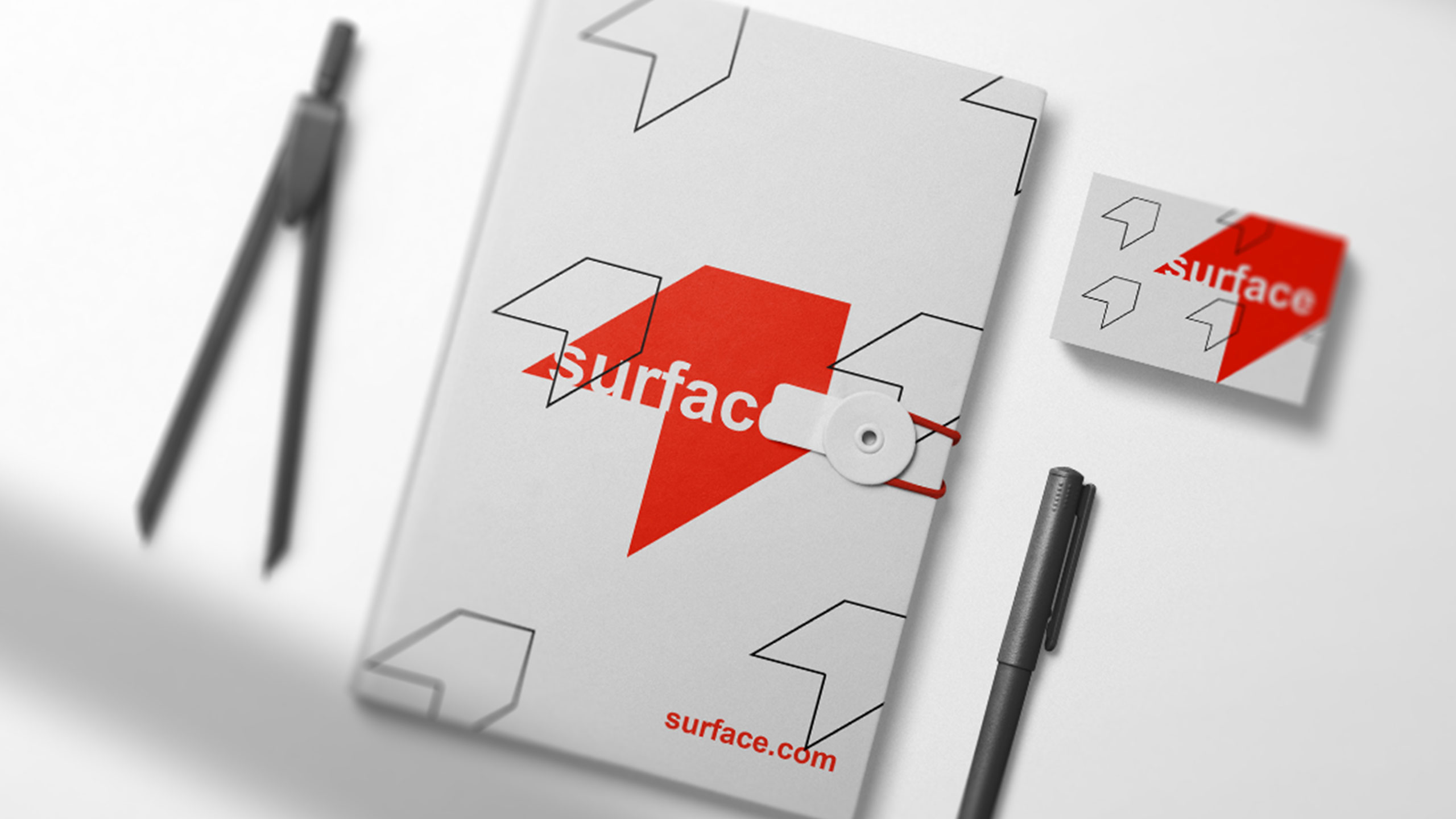
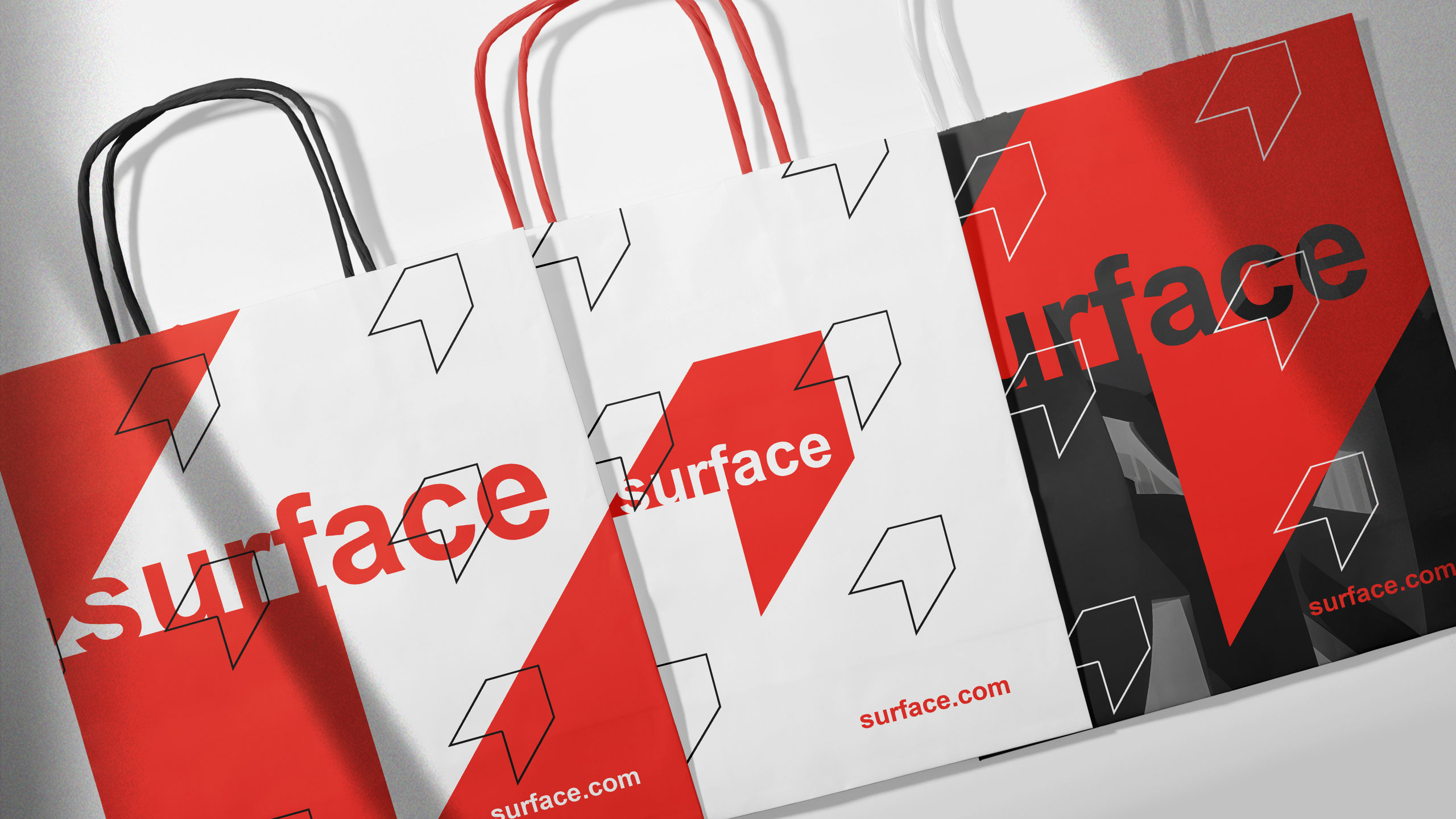
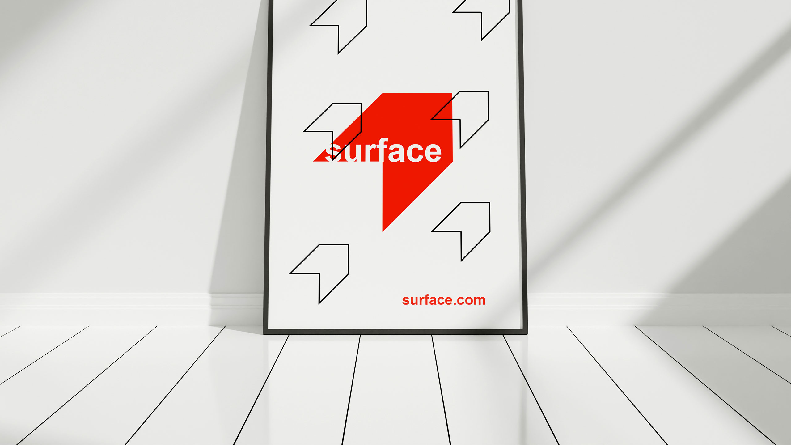
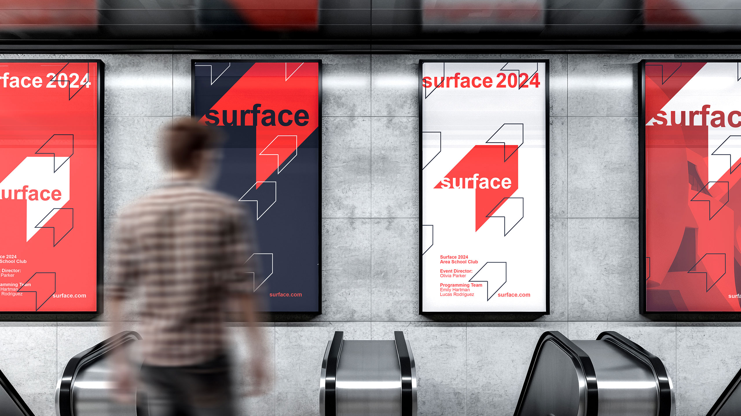
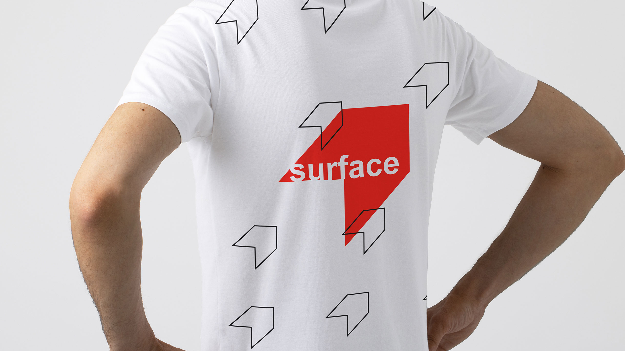
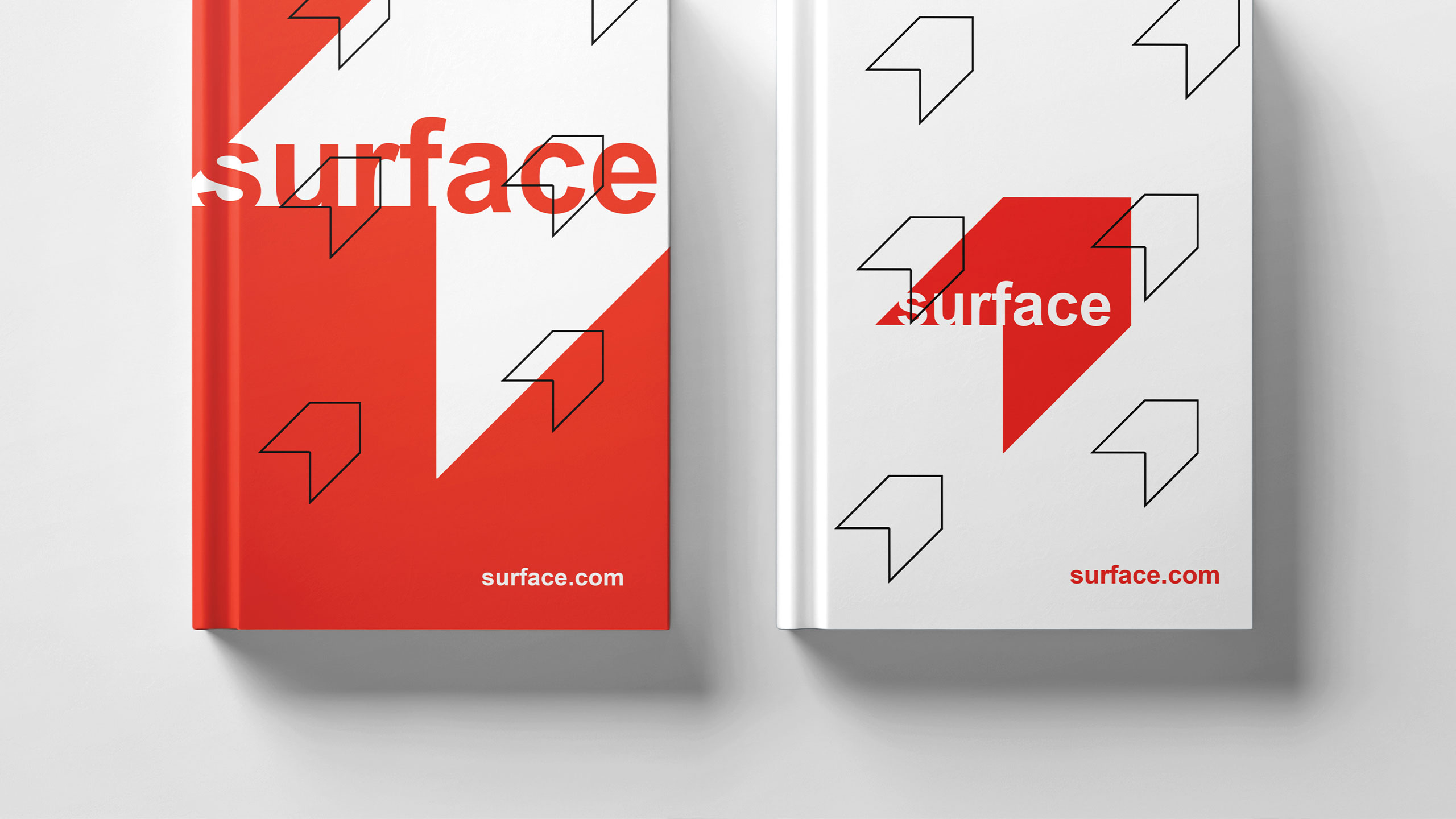
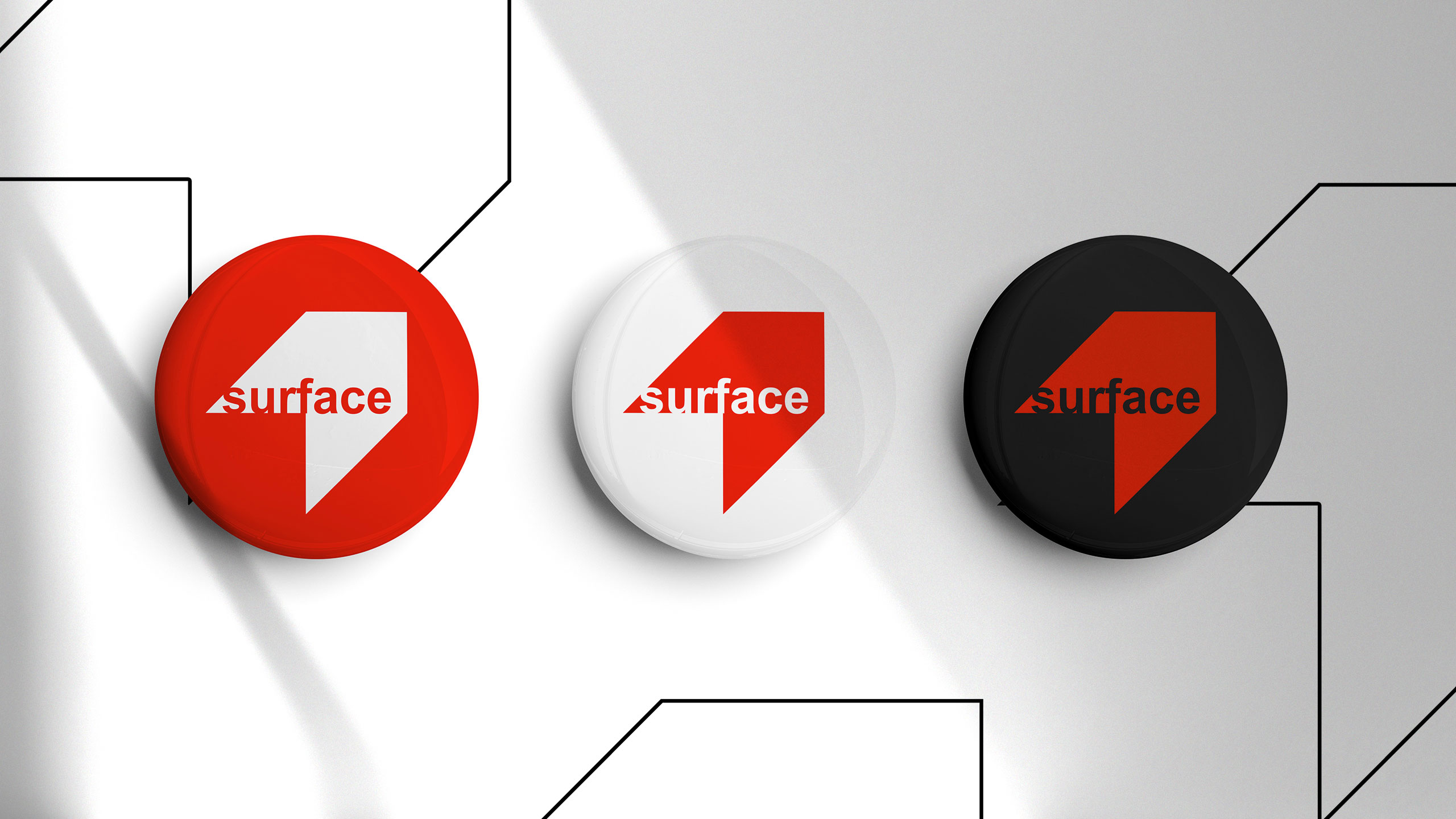
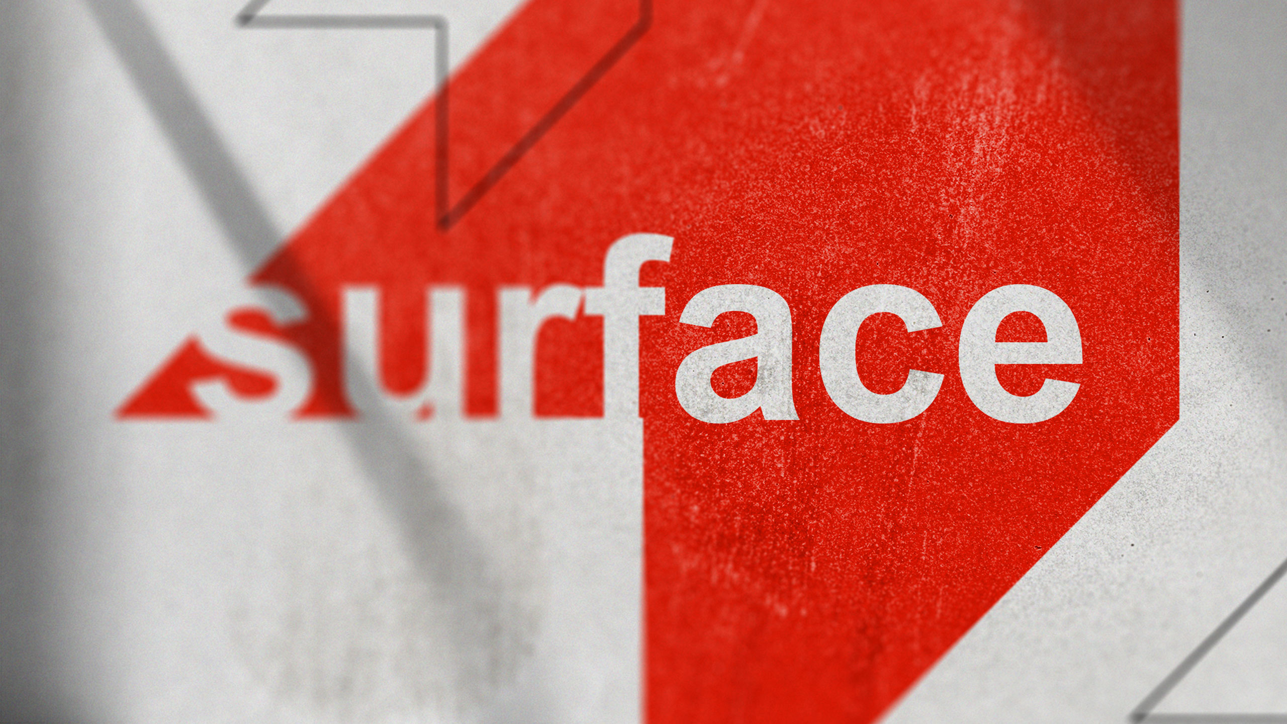
The graphic design for the brand Surface supports an architecture-themed exhibition. Dominated by red and white, the visual identity appears across event communication materials such as posters, visitor badges, tote bags, books, and stationery. The logo is central: a sharp, abstract form resembling a house roof's tip rotated 45 degrees.
Concept and Duality
It appears extruded like a 3D object but remains flat, creating visual ambiguity. This duality reflects the idea of "surface" as both plane and volume. The logo is minimalist and refined, evoking a bookmark or arrowhead, subtly reinforcing the architectural theme through clear, modern design.
Related
03
Whether you prefer a quick call or a detailed message, we're here to listen.

OVER

Café Lenoirs

Blen-Beck

Whare House