


Description
02
The Core Challenge
How can a graphic identity express sound without sound? EKO's challenge is to make music visible—through movement, rhythm, and energy—while staying clean, modern, and instantly recognizable.
Visual Language and Logo
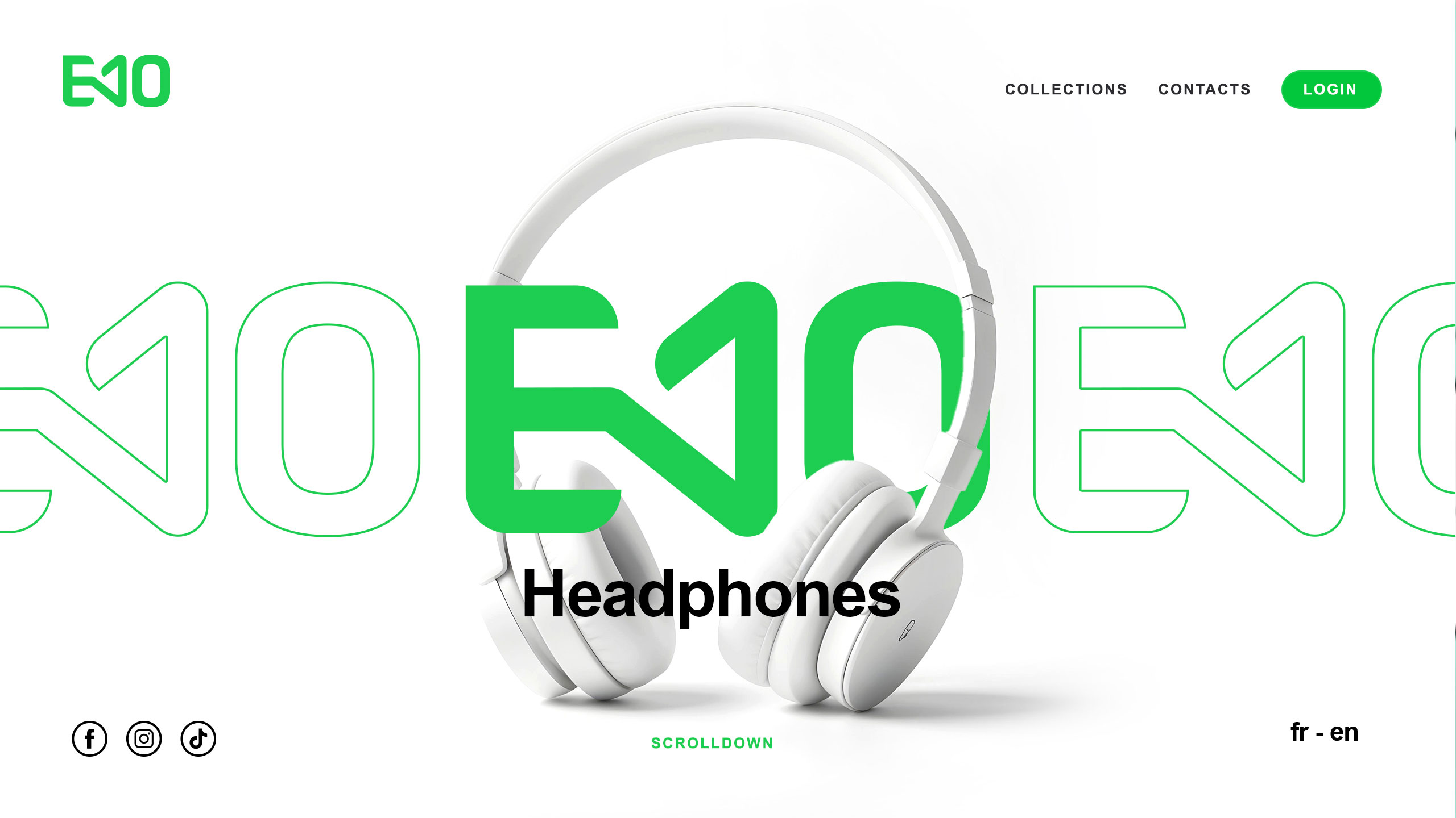
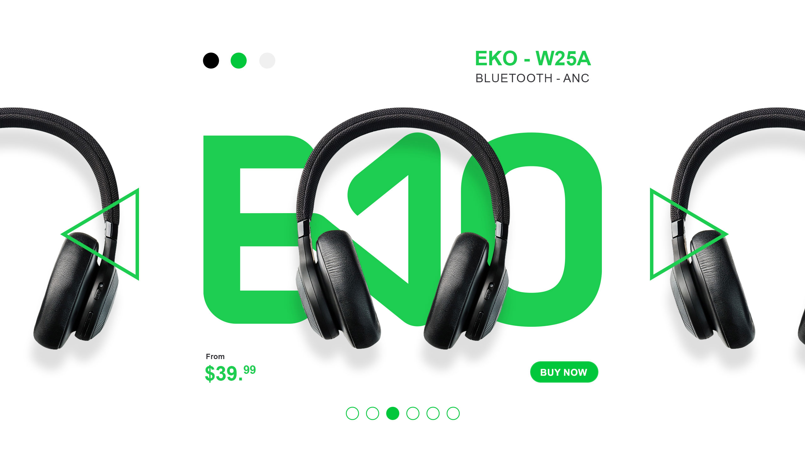
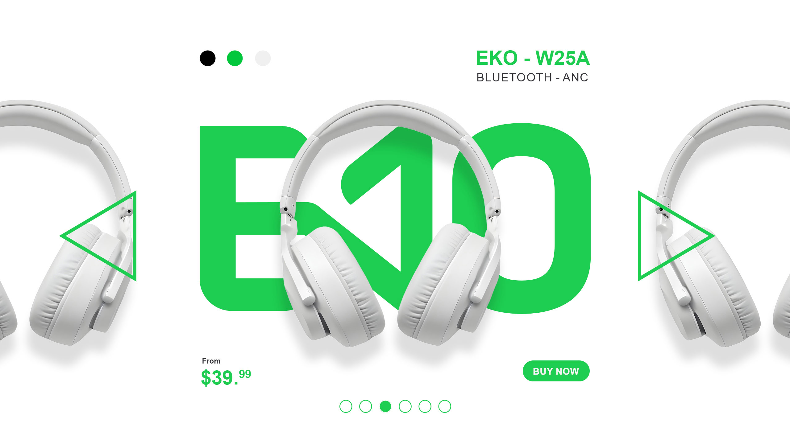
Clean and dynamic, the EKO website uses bold visual cues to reflect a love of sound and movement. At its core, the logo anchors the design: the "K" mimics a speaker volume icon, immediately suggesting audio function. Repeated in a wireframe style, the logo multiplies across the layout like echoes—reinforcing the brand name both visually and conceptually.
Palette and Atmosphere
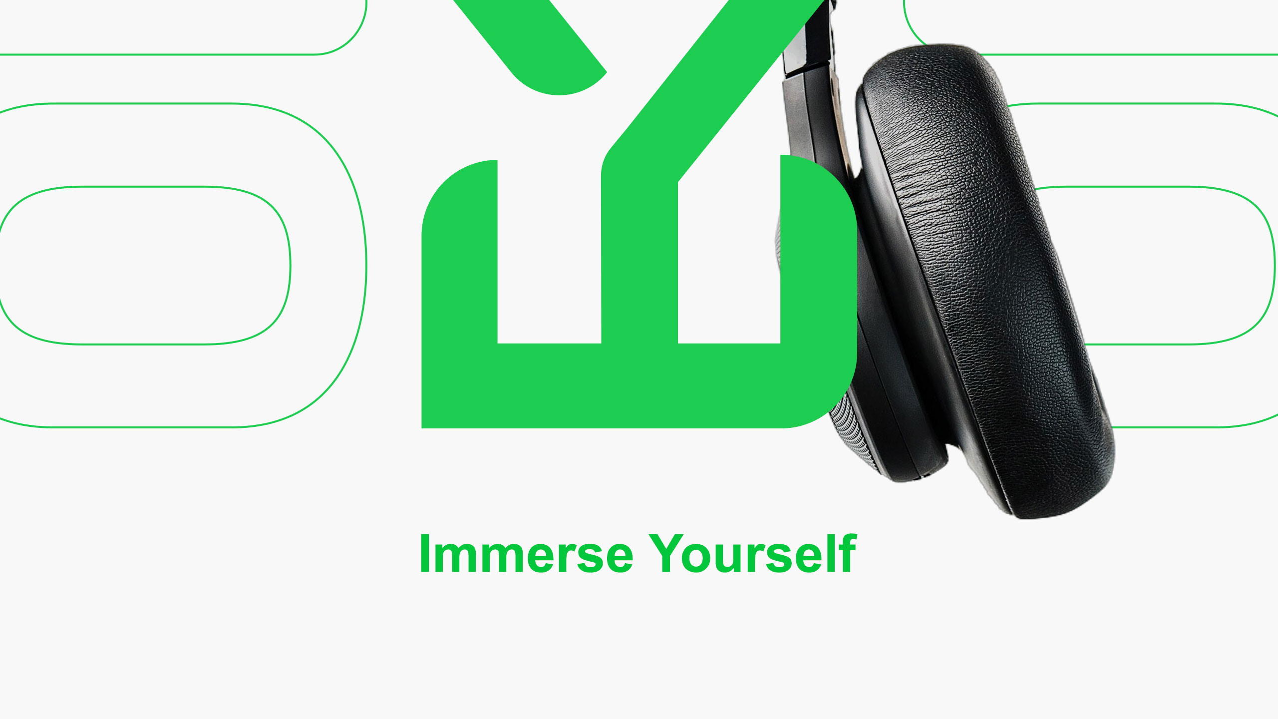
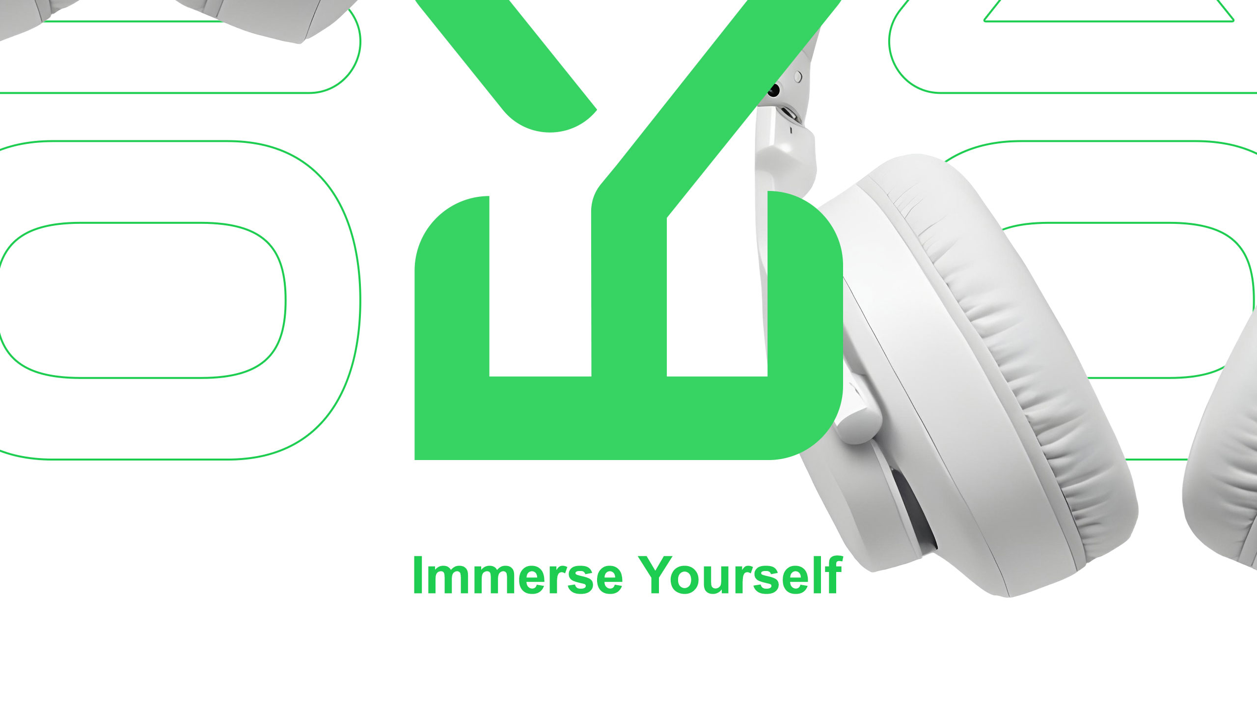
A bright neon green contrasts with pure white backgrounds, creating a vibrant, high-energy atmosphere aimed at a young, mobile, music-loving audience. The spacious white layout adds clarity and breathability, subtly hinting at the precision and purity of EKO's audio performance.
Related
03
Whether you prefer a quick call or a detailed message, we're here to listen.

Bombyx

HoverSpeed

Kerozen

Eighteen