


Description
02
The Core Challenge
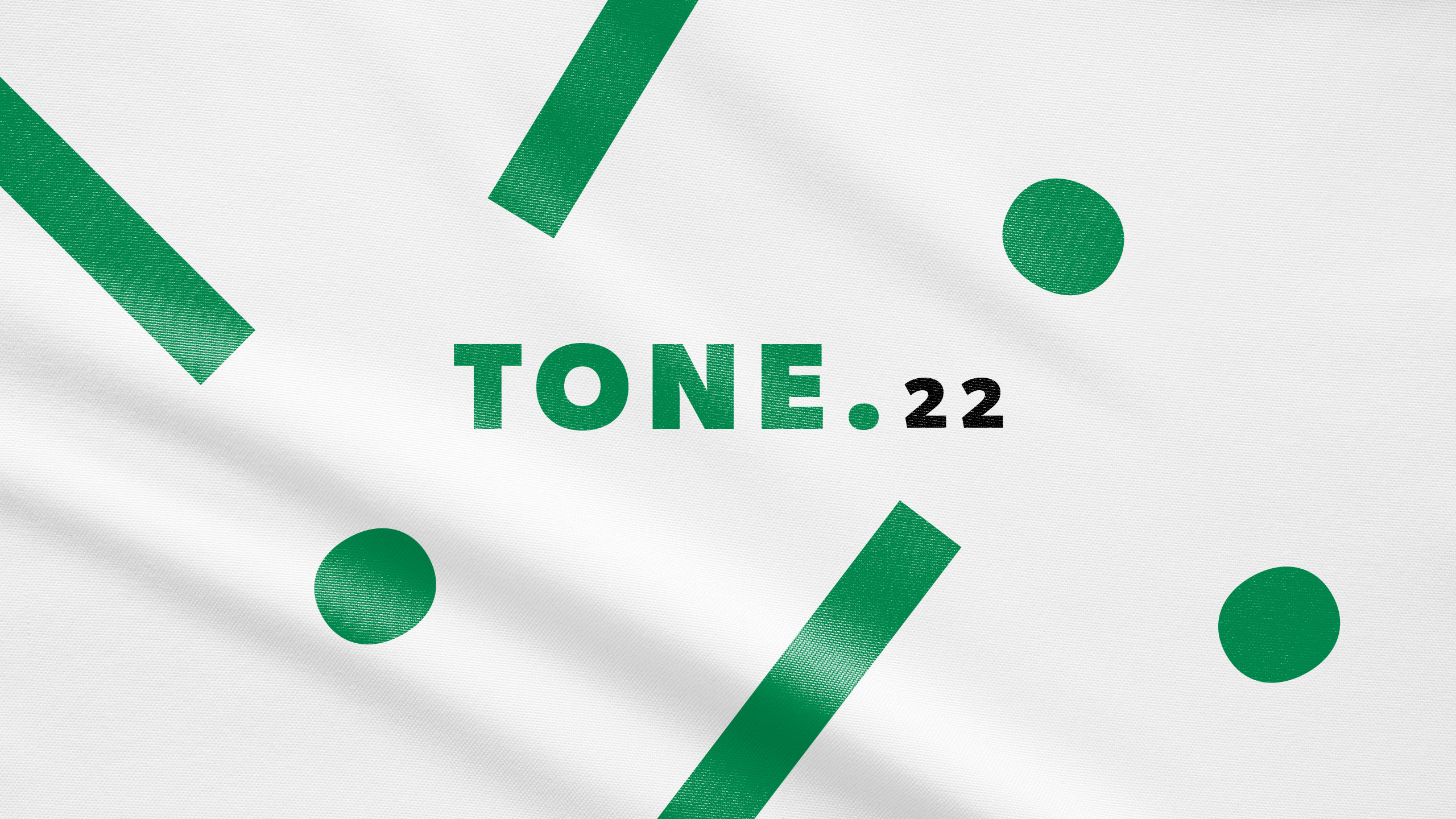
How can design visually capture music's energy and harmony? TONE 22's vibrant greens and animated typography explore rhythm, nature, and authenticity, creating a dynamic identity that celebrates sound and movement.
Visual Language and Typography
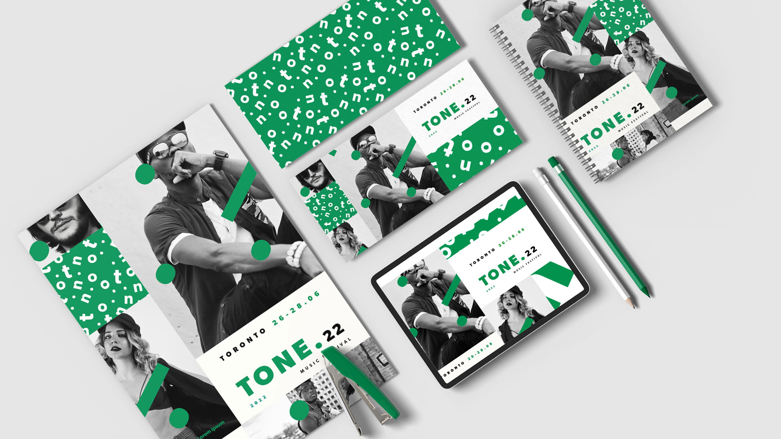
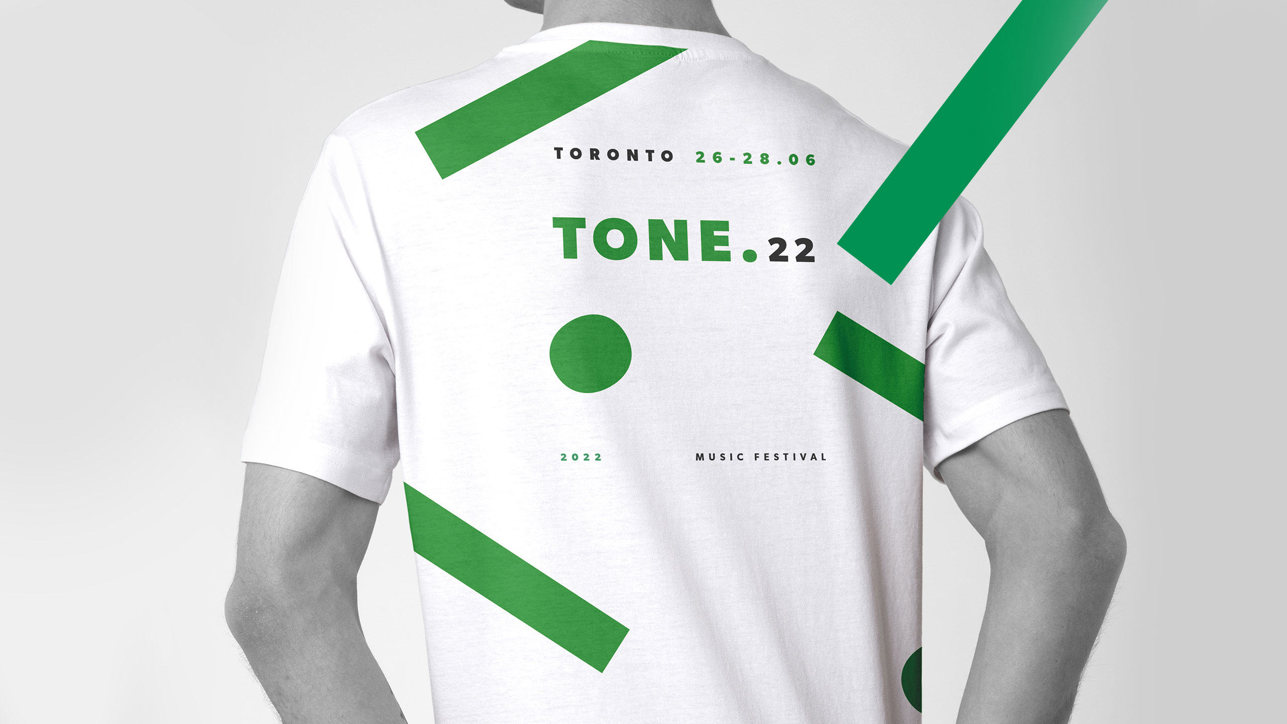
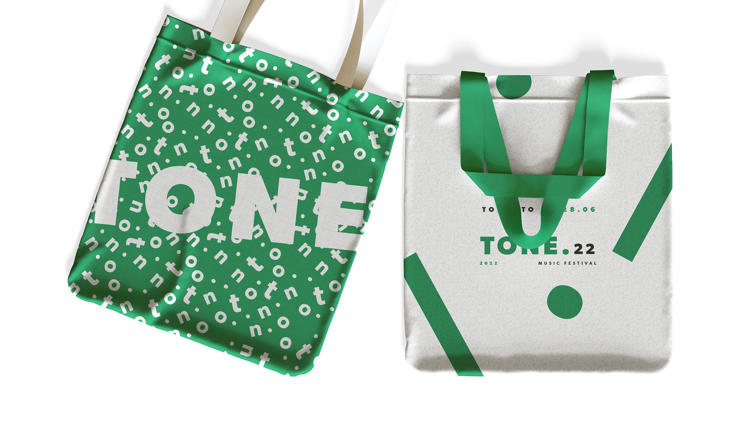
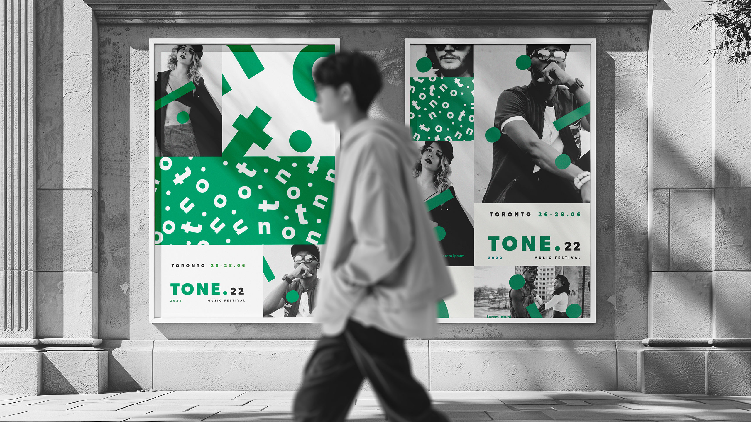
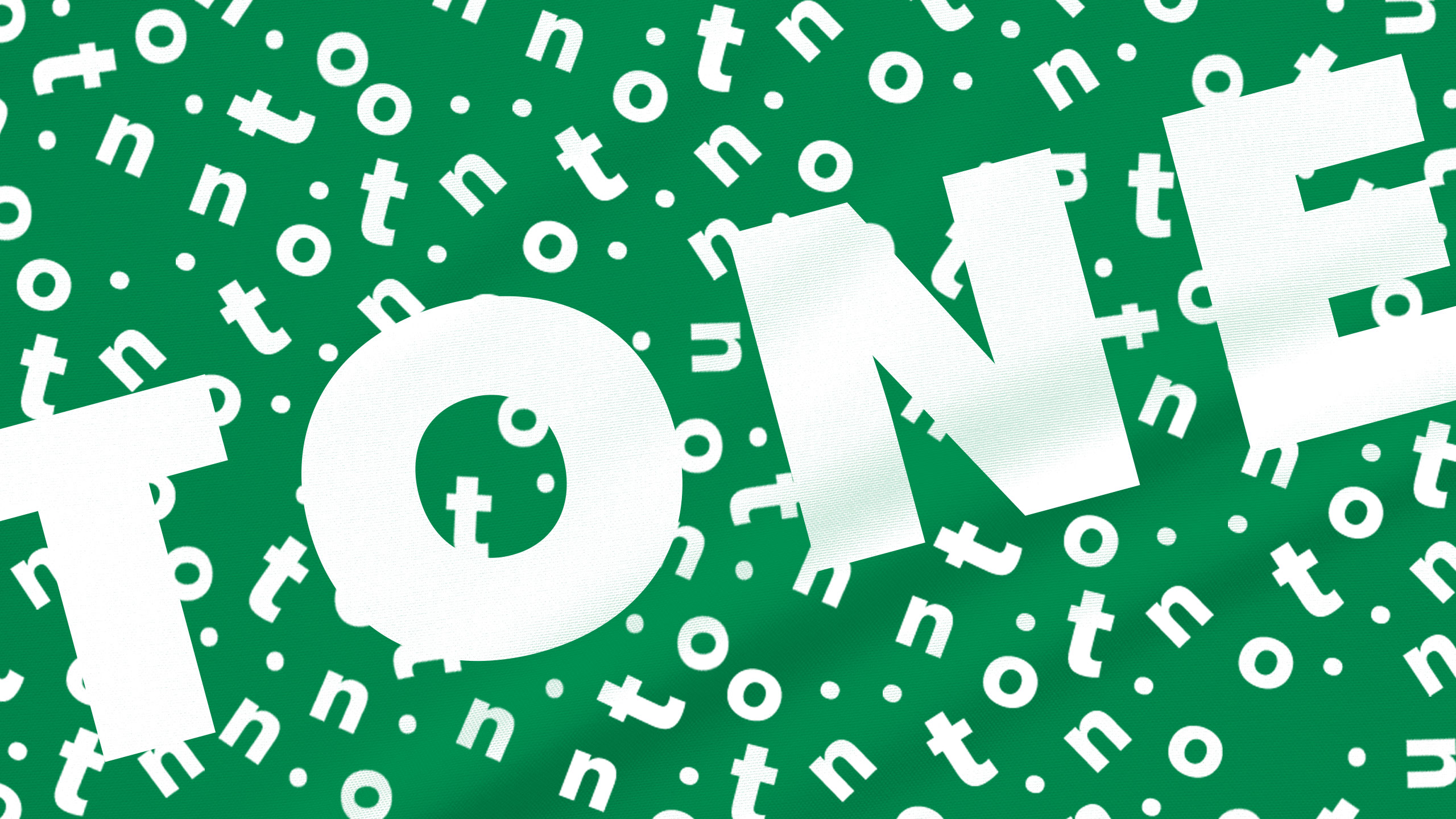
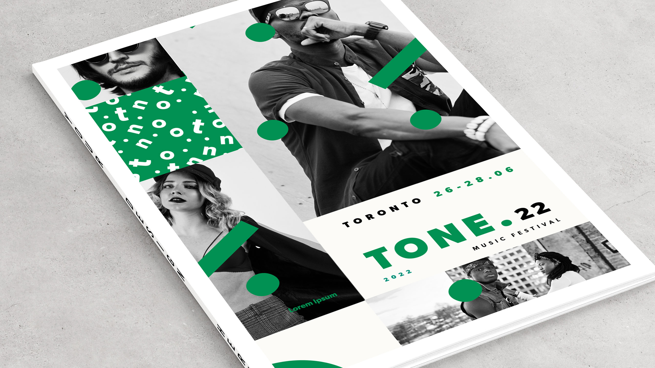
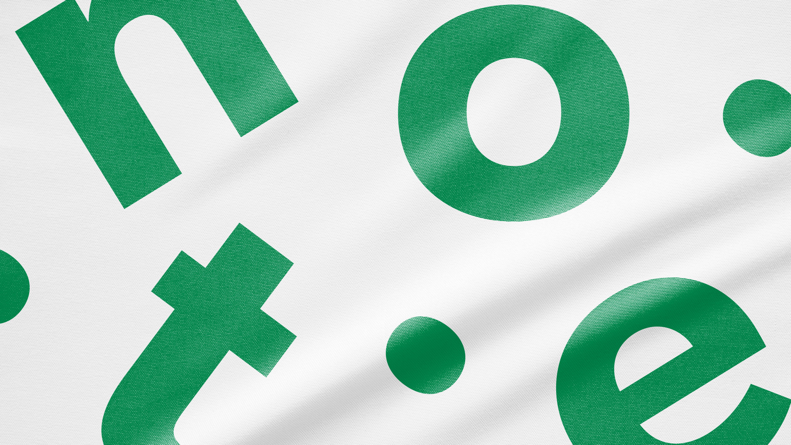
The visual identity of TONE 22, a music festival, features a fresh and expressive graphic design. Dominated by vibrant shades of green, the visuals evoke energy, nature, and harmony. A key element is the typographic animation of the word "TONE," which occasionally shifts into "NOTE," subtly reinforcing the festival's musical theme.
Photography and Application
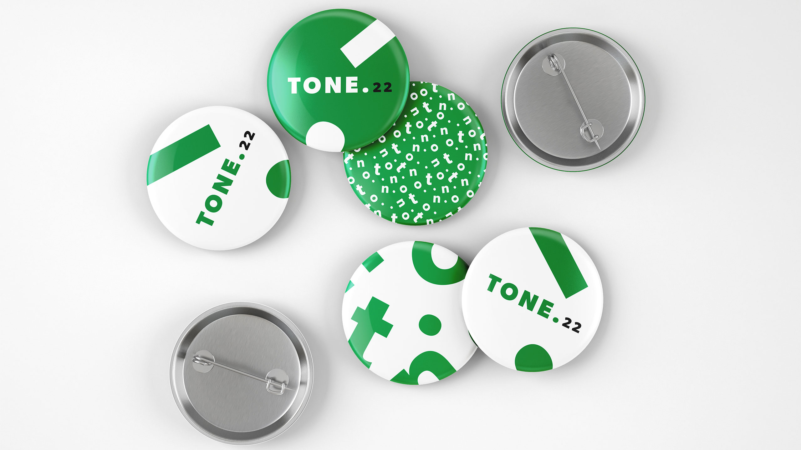
Black and white photos of musicians provide contrast and authenticity, while animated graphic elements — reminiscent of jazzy, bouncing notes — bring rhythm and motion to the compositions. The identity is applied across posters, t-shirts, tote bags, tickets, books, stationery, and newspapers, offering a playful yet refined celebration of sound.
Related
03
Whether you prefer a quick call or a detailed message, we're here to listen.

OVER

Café Lenoirs

Blen-Beck

Whare House