


Description
02
The Core Challenge
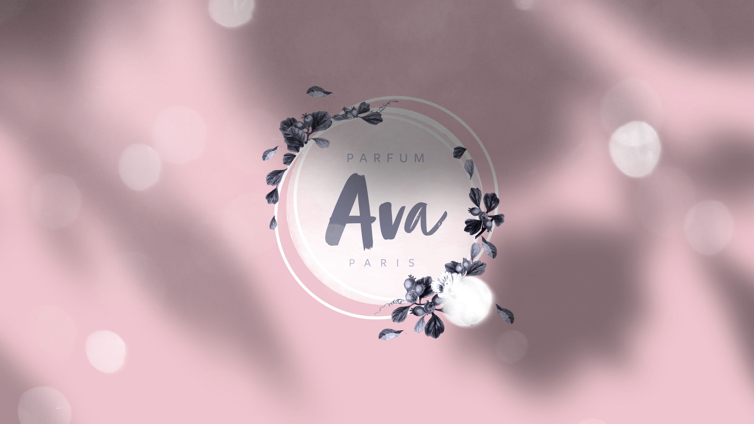
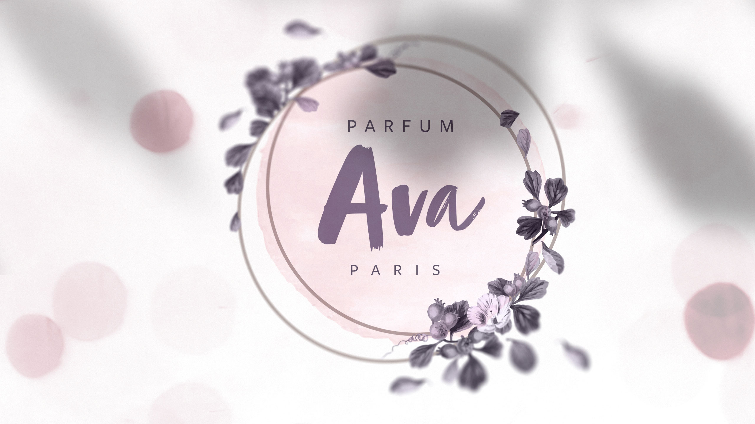
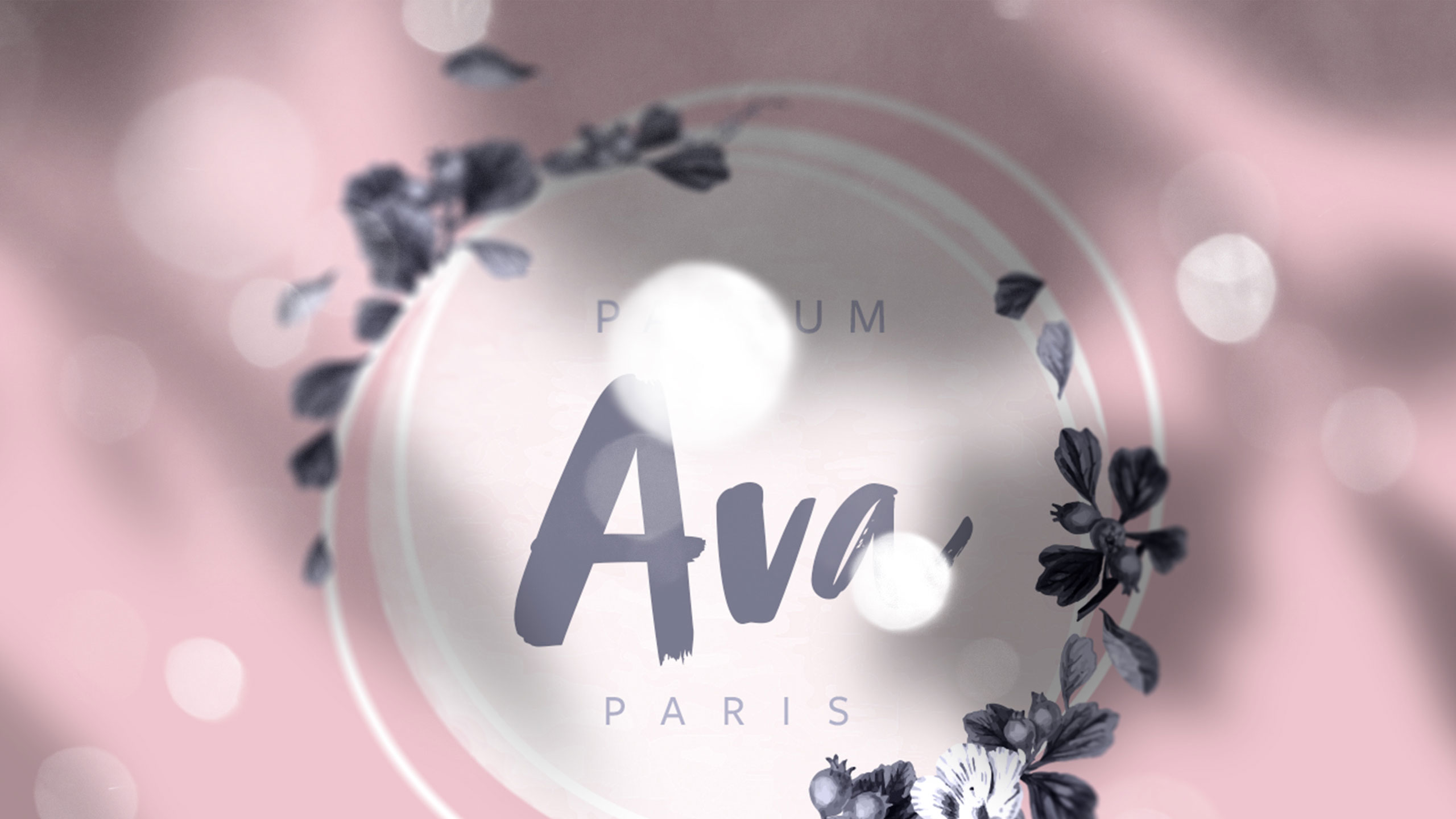
How can graphic design translate fragrance into emotion? AVA's identity explores softness and intimacy through pale tones, floral frames, and handwritten details—turning visual elements into a delicate, sensory expression of femininity.
Visual Language and Application
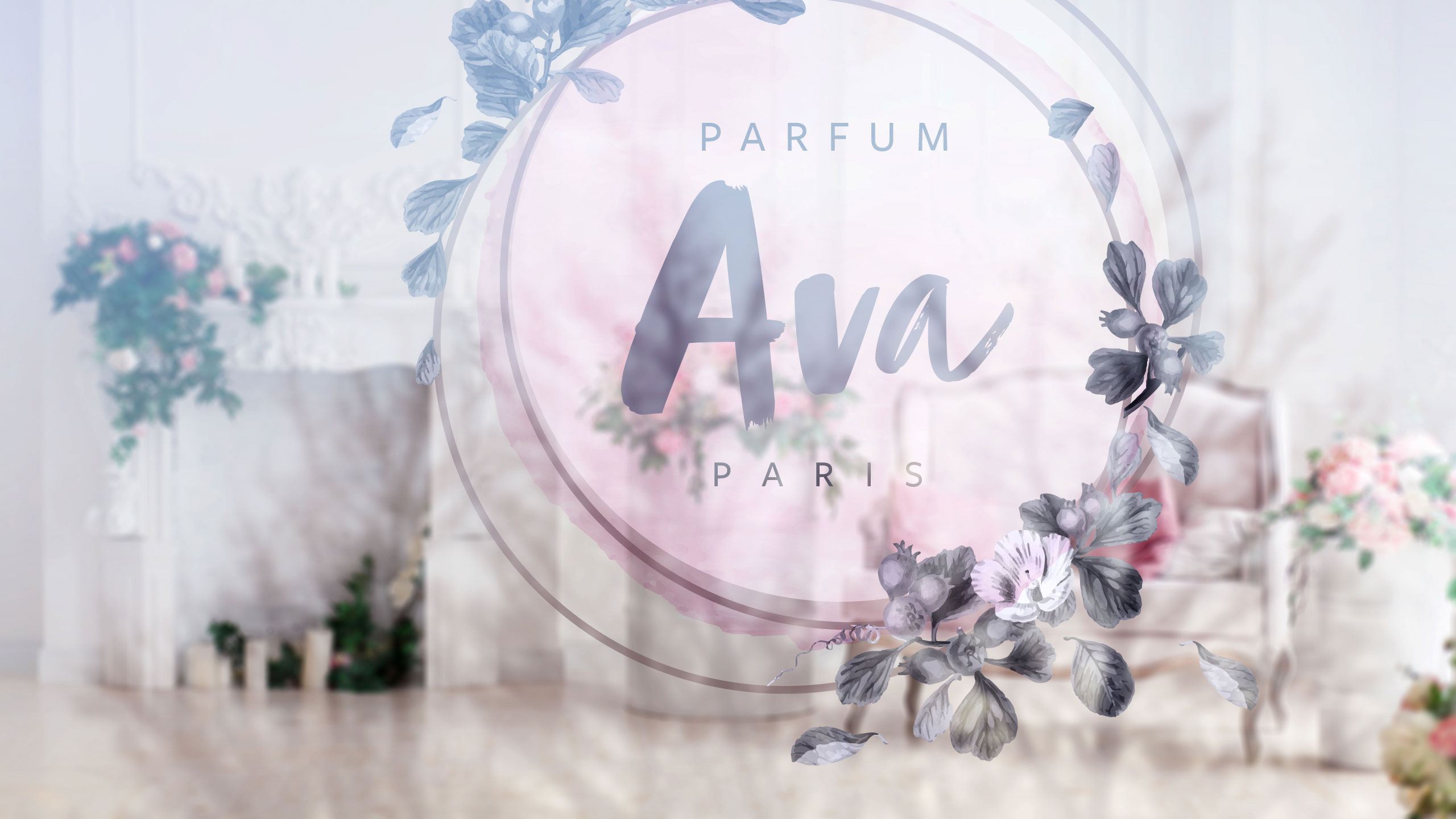
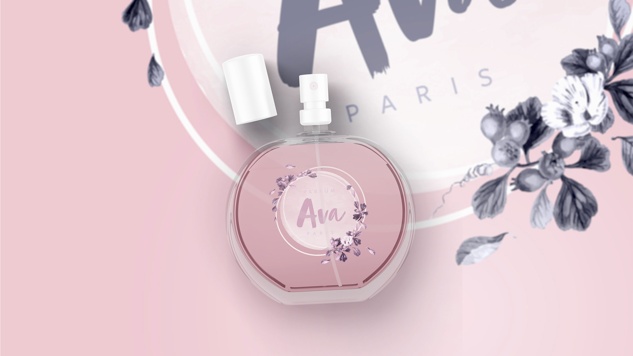
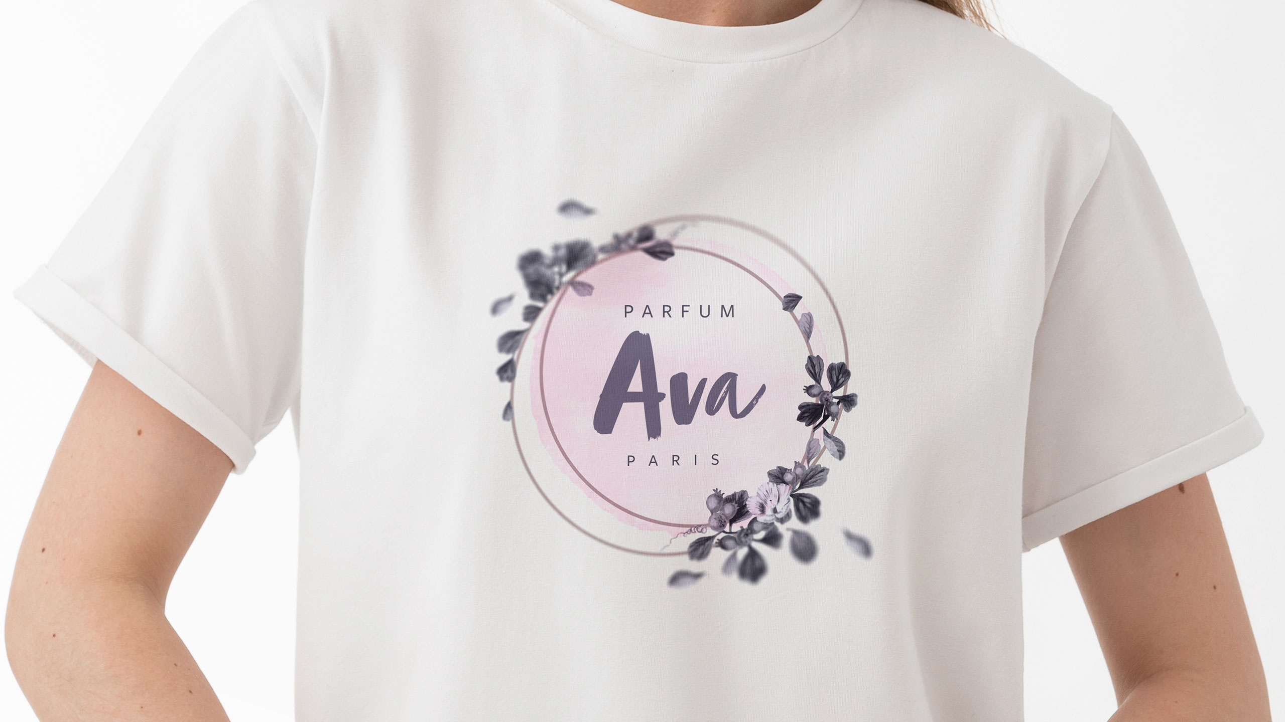
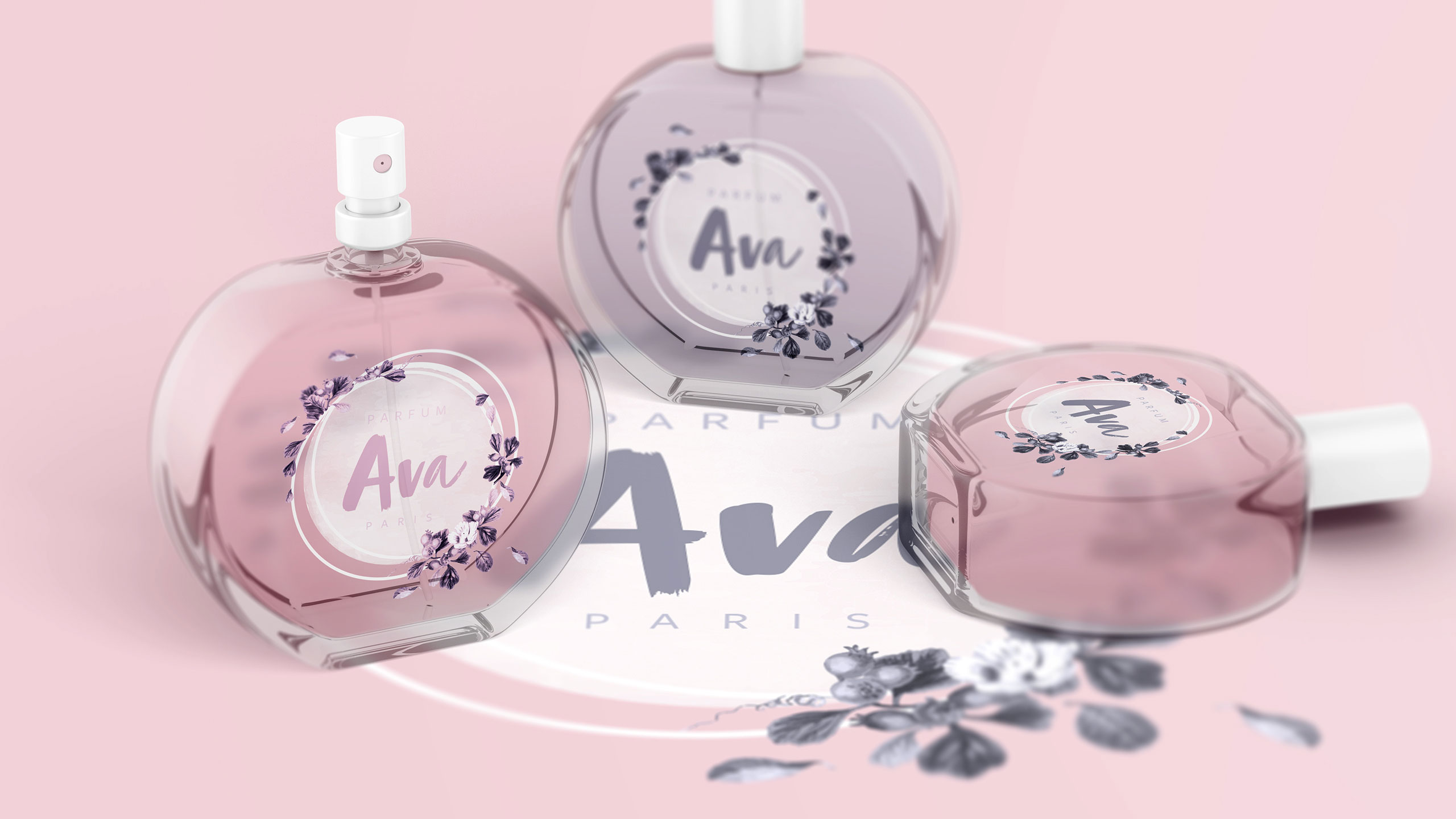
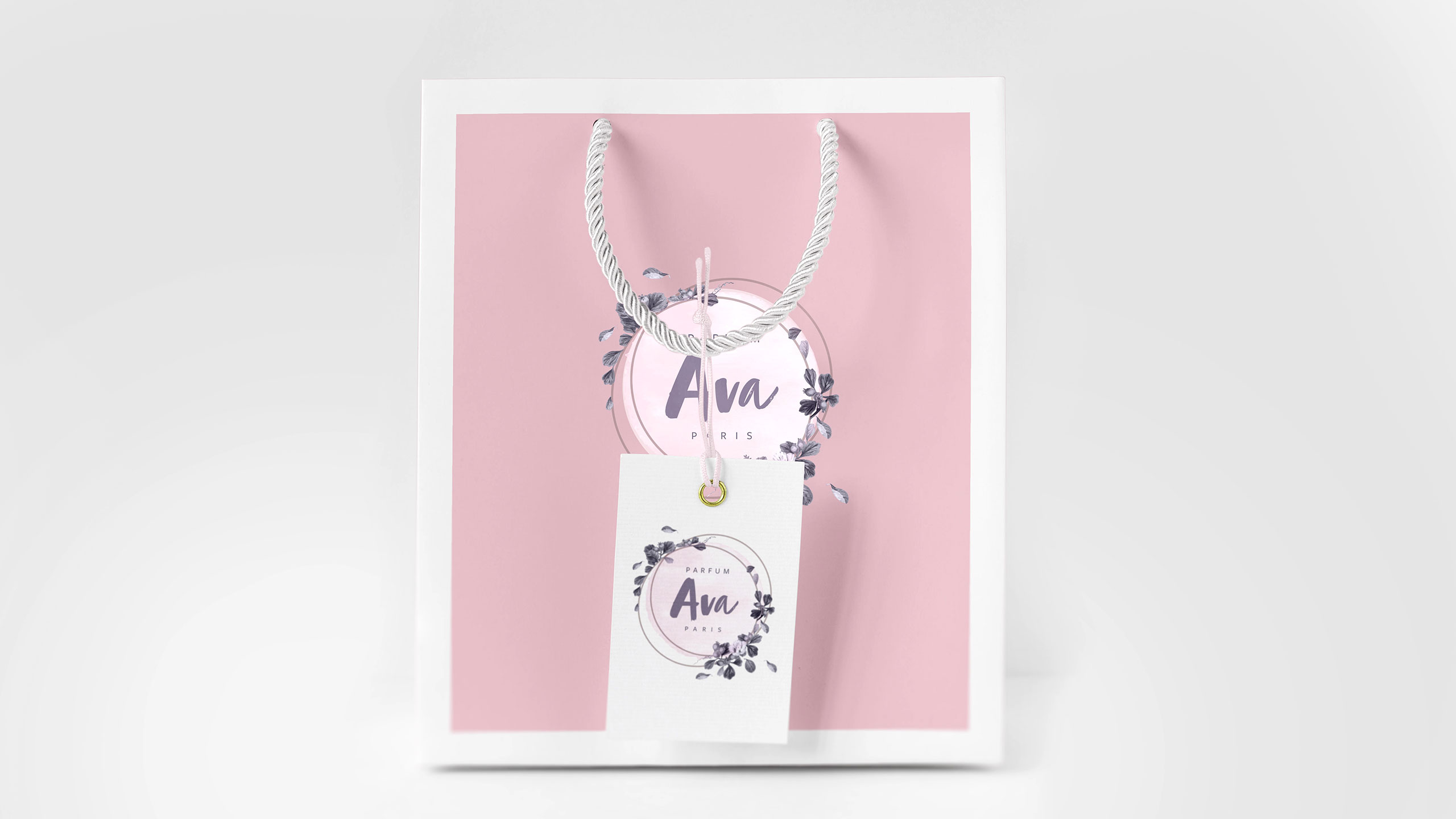
The graphic design for AVA, a perfume brand, features a delicate and feminine aesthetic applied across store windows, stationery, T-shirts, bags, perfume bottles, and packaging. The dominant pale pink and violet palette evokes traditional feminine elegance. At the center, a handwritten-style logo appears like a signature enclosed within a medallion, framed by floral motifs that echo the fragrance's essence.
Emotion and Identity
Combined with soft whites and light tones, the presence of flowers enhances the sense of fragility, youth, and sensitivity. The overall design expresses a poetic and intimate femininity, capturing the emotional and sensory dimensions of the perfume experience.
Related
03
Whether you prefer a quick call or a detailed message, we're here to listen.

OVER

Café Lenoirs

Blen-Beck

Whare House