


Description
02
The Core Challenge
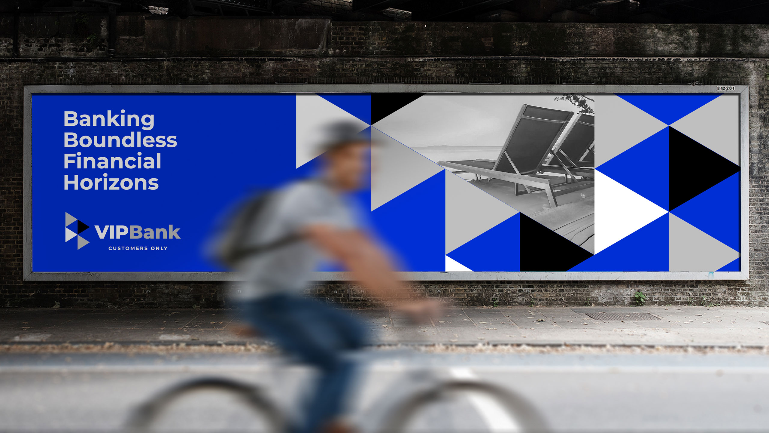
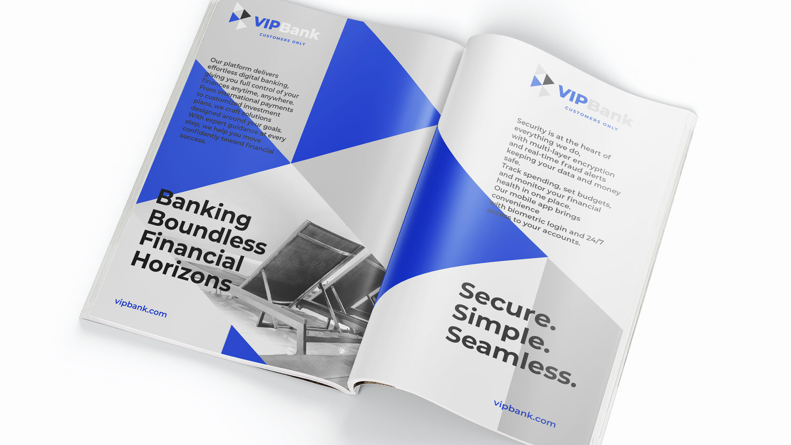
How can graphic design embody trust and ambition for a travel-focused bank? VIP Bank uses a sleek palette and dynamic triangles to symbolize progress, merging financial reliability with the freedom of travel.
Visual Language and Application
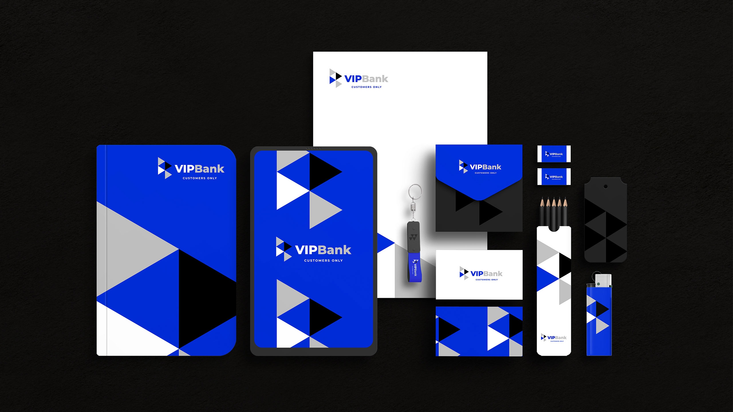
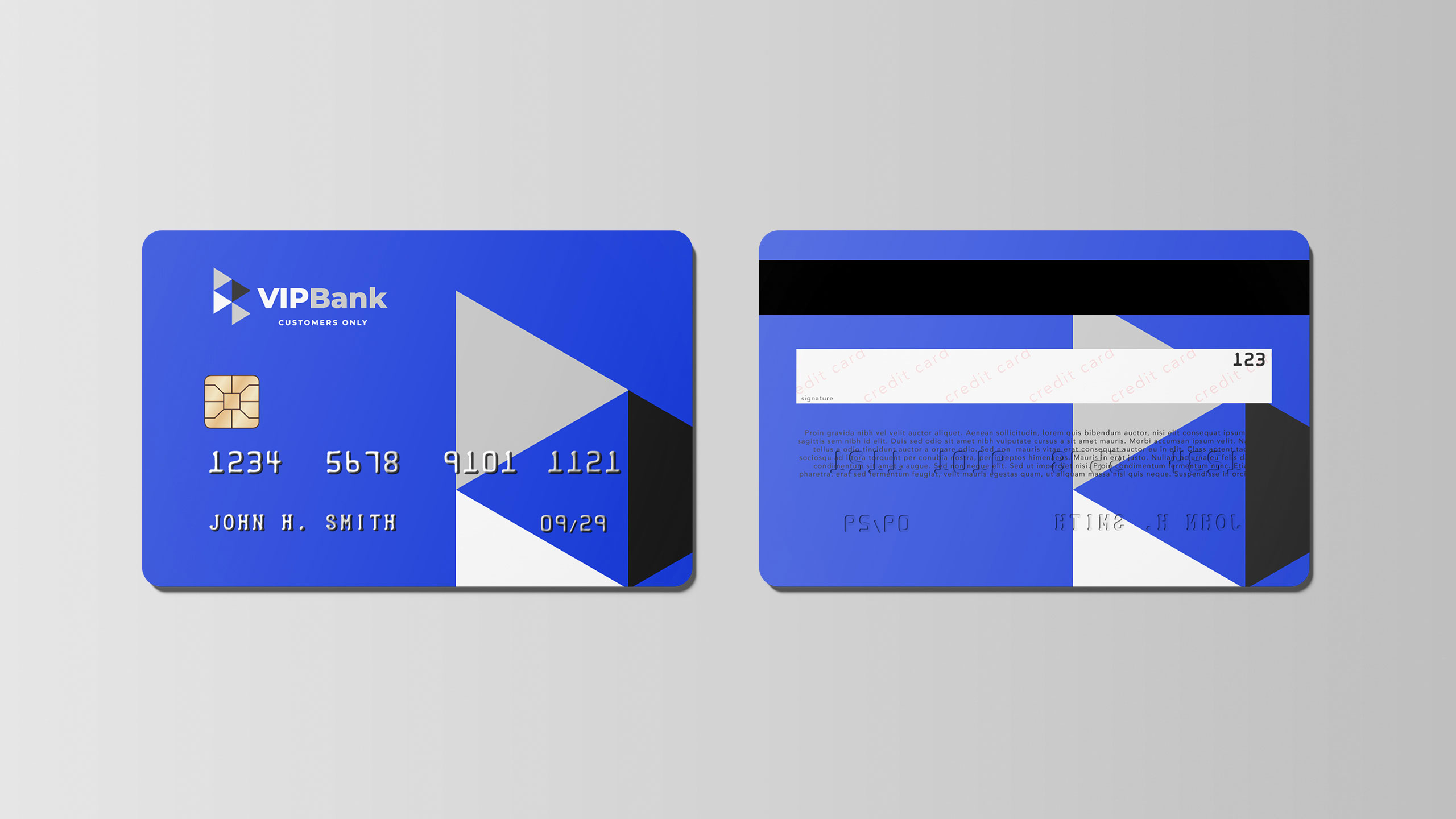
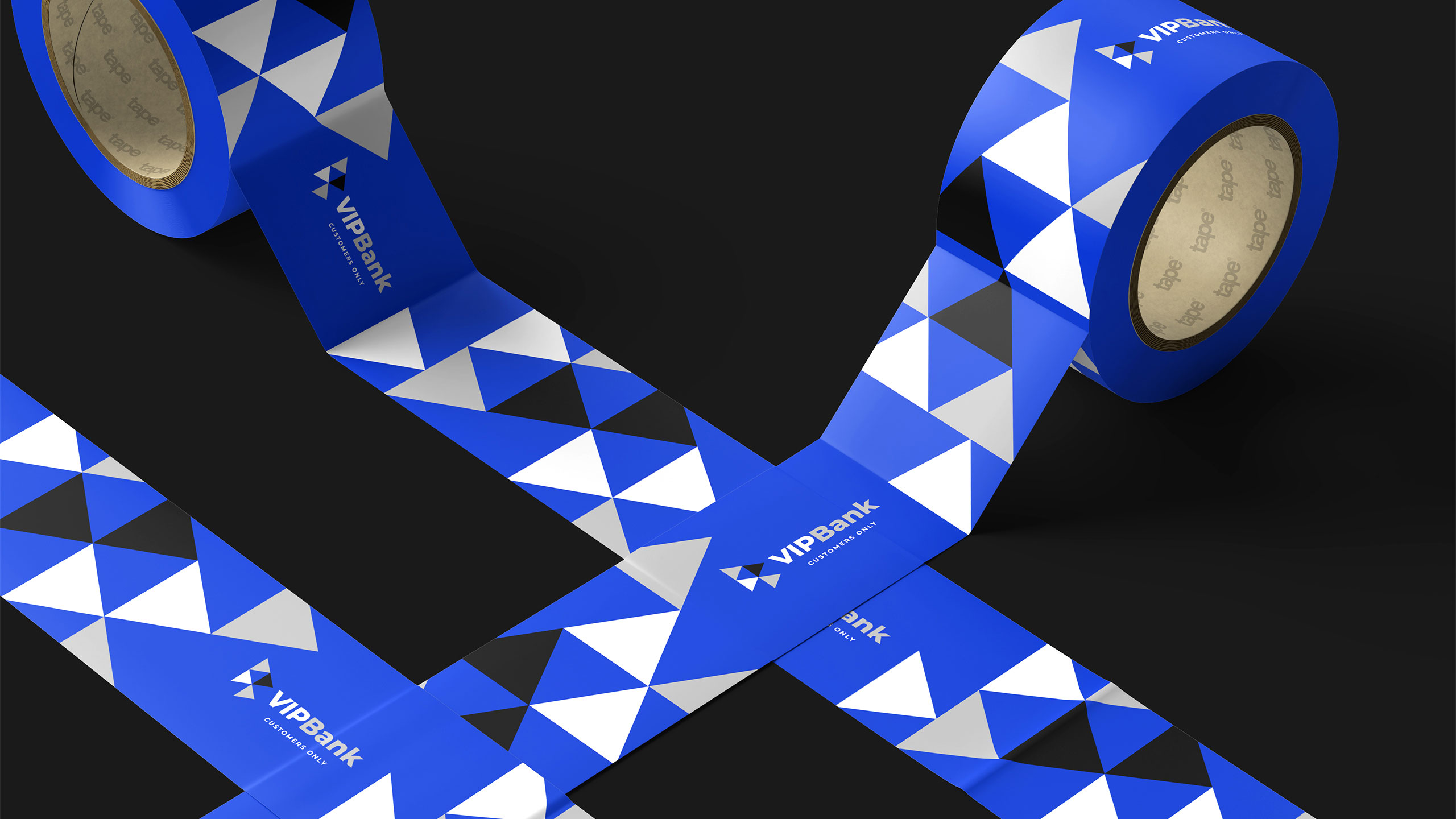
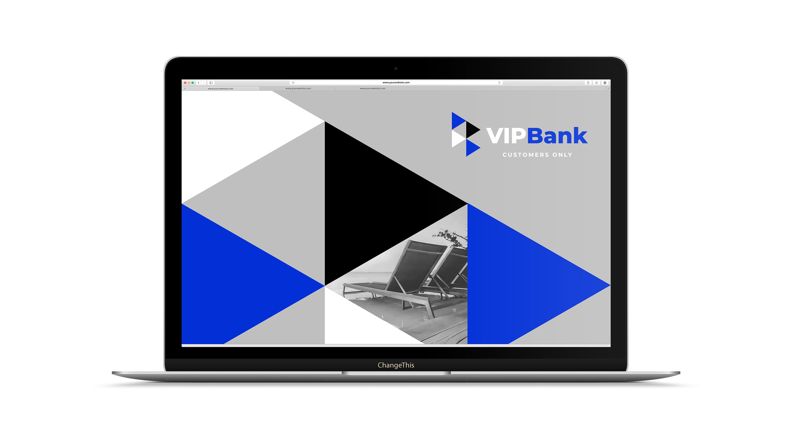
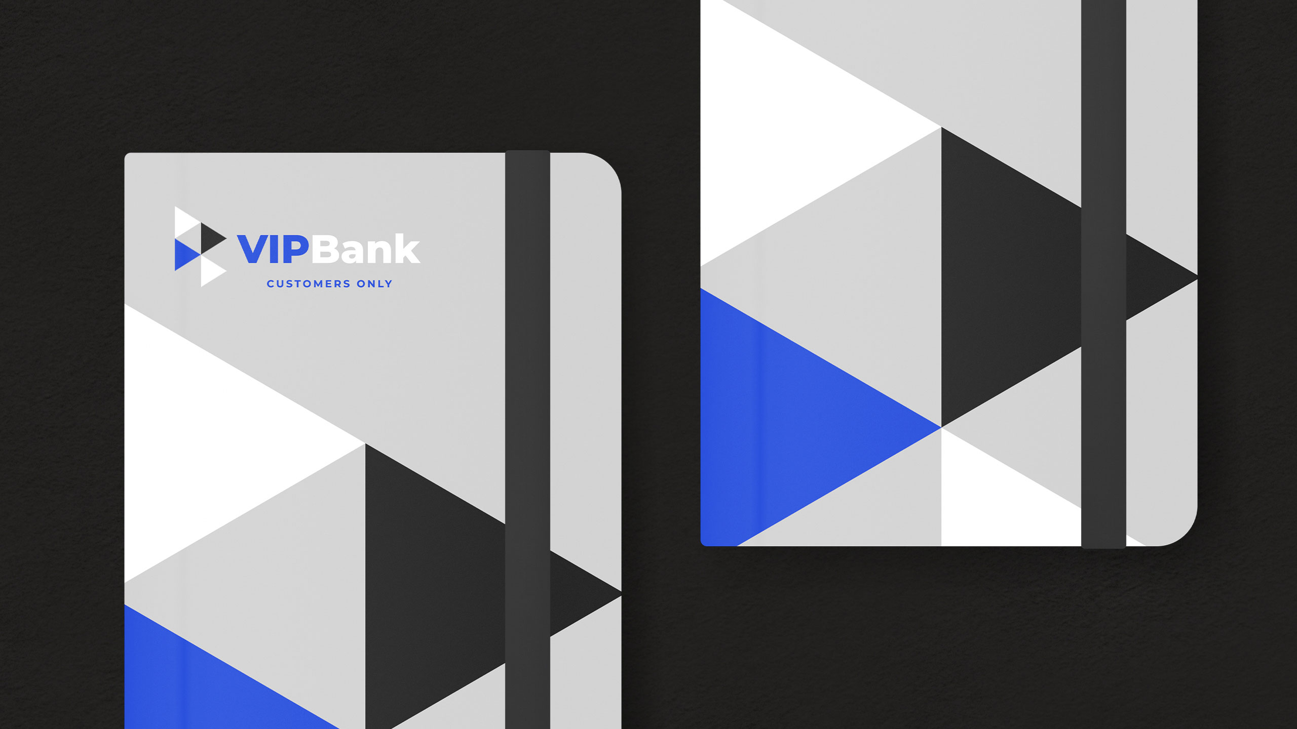
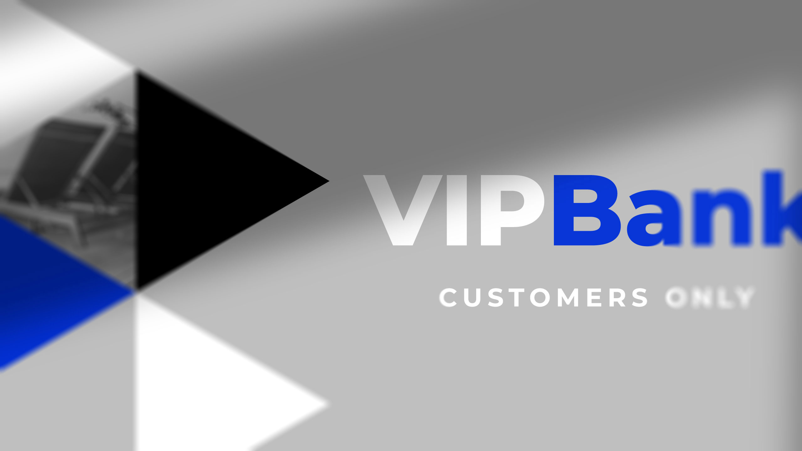
The graphic design for VIP Bank, a banking service tailored for frequent travelers, embraces a sleek, corporate identity with a refined palette of blue, white, grey, and black—"blue for travel." The branding is deployed across credit cards, stationery, storefronts, posters, ads, and T-shirts.
Design System and Message
At its core is a dynamic, modular system of triangular shapes, reminiscent of directional arrows or a flag in motion, symbolizing progress and movement. This bold yet professional visual language connects the idea of financial trust with ambition and freedom, encouraging clients to go further—both in their travels and personal projects—with VIP Bank by their side.
Related
03
Whether you prefer a quick call or a detailed message, we're here to listen.

OVER

Café Lenoirs

Blen-Beck

Whare House